# Daterangepicker
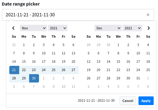
<x-boilerplate::daterangepicker name="daterange" label="Date range picker" />
Will render
# Attributes
Attributes that can be used with this component :
| Option | Type | Default | Description |
|---|---|---|---|
| name | string | null | Input name (required) |
| start | string | carbon | null | The beginning date of the initially selected date range |
| end | string | carbon | null | The end date of the initially selected date range |
| min-date | string | carbon | null | The earliest date a user may select |
| max-date | string | carbon | null | The latest date a user may select |
| timePicker | boolean | false | Adds select boxes to choose times in addition to dates |
| timePickerIncrement | integer | 1 | Increment of the minutes selection list for times |
| timePickerSeconds | boolean | false | Show seconds in the timePicker. |
| timePicker24Hour | boolean | true | Use 24-hour instead of 12-hour times, removing the AM/PM selection |
| alignment | string | "left" | Whether the picker appears aligned to the left, to the right, or centered under the HTML element it's attached to |
| label | string | null | Input label, can be a translation string |
| help | string | null | Help message that will be displayed under the input field |
| prepend-text | string | Empty string | Text that will be added on the left side of the input, can be a font-awesome icon class |
| append-text | string | Empty string | Text that will be added on the right side of the input, can be a font-awesome icon class |
| class | string | Empty string | Additionnal class that will be added to the input field |
| control-class | string | Empty string | Additionnal class that will be added to the form-control wrapping the input field |
| group-class | string | null | Additionnal class that will be added to form-group |
| group-id | string | null | ID that will be added to form-group |
| id | string | autogenerated | Id of the input field |
# Dates
To define the default date, you can set the value attribute with a string or an instance of Carbon.
<x-boilerplate::daterangepicker name="daterange" start="2021-09-08" end="2021-11-21" />
<x-boilerplate::daterangepicker name="daterange" start="2021-09-08 13:40:05" end="2021-11-21 18:00:55" timePicker="true" />
<x-boilerplate::daterangepicker name="daterange" :start="\Illuminate\Support\Carbon::now()->subDays(10)" :end="\Illuminate\Support\Carbon::now()" />
# Posted values
Three values are submitted when the component is in a form. Each of these is prefixed by the value of the "name" field.
E.g.
<x-boilerplate::daterangepicker name="daterange" start="2021-09-08" end="2021-11-21" />
Posted values :
$request->input('daterange.value') = "2021-09-08 - 2021-11-21" // Depends on the format used
$request->input('daterange.start') = "2021-11-21 00:00:00" // Format is always "Y-m-d H:i:s"
$request->input('daterange.end') = "2021-11-21 00:00:00" // Format is always "Y-m-d H:i:s"