# Password
<x-boilerplate::password name="password" />
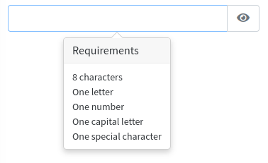
Will render a field with a button to switch the visibility of the password and requirements when focusing the field.
# Attributes
Attributes that can be used with this component :
| Option | Type | Default | Description |
|---|---|---|---|
| name | string | null | Input name (required) |
| check | boolean | true | If true, will show the popover with requirements |
| length | integer | 8 | Minimum password length |
| label | string | name | Input label, can be a translation string |
| help | string | null | Help message that will be displayed under the input field |
| group-class | string | null | Additionnal class that will be added to form-group |
| group-id | string | null | ID that will be added to form-group |
All of the attributes that are not in the list above will be added as attributes to the input field :
<x-boilerplate::password name="example" data-toggle="tooltip" data-title="Tooltip content" />
NB : for non primitive values that not using a simple string you have to use the : character as a prefix :
<x-boilerplate::password name="example" :placeholder="__('stringToTranslate')"/>
# Password validation rule
To validate the field that will be posted when using this component, you can use the rule Sebastienheyd\Boilerplate\Rules\Password.
You can set the password required length by passing the value to the constructor.
use Sebastienheyd\Boilerplate\Rules\Password;

$this->validate($request, [
    'password'              => ['nullable', new Password(8)],
    'password_confirmation' => 'same:password',
]);