# Smallbox
<x-boilerplate::smallbox />
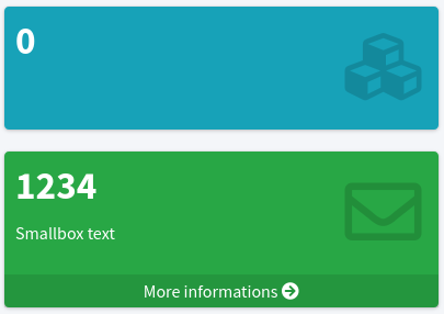
<x-boilerplate::smallbox color="green" nb="1234" text="Smallbox text" icon="far fa-envelope" link="#" link-text="More informations"/>
Will render
# Attributes
Attributes that can be used with this component :
| Option | Type | Default | Description |
|---|---|---|---|
| color | string | Defined in theme configuration | Background color for the icon. By default, the color is the default card color setted in the configuration file |
| nb | string | 0 | Number (title) |
| text | string | Empty string | Text shown under the number, can be a translation string |
| icon | string | "fas fa-cubes" | Font Awesome (opens new window) icon to use |
| link | string | Empty string | Bottom link href |
| link-text | string | Empty string | Bottom link text |
| class | string | Empty string | Extra class to add to the main div |
All of the attributes that are not in the list above will be added as attributes to the main div.
NB : for non primitive values that not using a simple string you have to use the : character as a prefix :
<x-boilerplate::infobox :link="route('boilerplate.users.index')" :link-text="__('boilerplate::users.list.title')"/>