# Infobox
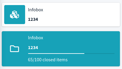
<x-boilerplate::infobox message="Infobox" number="1234"/>
<x-boilerplate::infobox message="Infobox" number="1234" bg-color="info" color="info" icon="far fa-folder" progress="65" description="65/100 closed items"/>
Will render
# Attributes
Attributes that can be used with this component :
| Option | Type | Default | Description |
|---|---|---|---|
| bg-color | string | white | Background color |
| class | string | Empty string | Extra class to add to the main div |
| color | string | Defined in theme configuration | Background color for the icon. By default, the color is the default card color setted in the configuration file |
| icon | string | "fas fa-cubes" | Font Awesome (opens new window) icon to use |
| text | string | Empty string | Top text |
| number | string | Empty string | Number or text the will be shown under the message text |
| progress | number | 0 | Progress bar length in percent |
| description | string | Empty string | Description text that will be shown under the percent bar |
All of the attributes that are not in the list above will be added as attributes to the main div.
NB : for non primitive values that not using a simple string you have to use the : character as a prefix :
<x-boilerplate::infobox :progress="round(0.64654 * 100)" />